How tk999 Speaks Without Words: Icons, Colour and Imagery
How tk999 Speaks Without Words: Icons, Colour and Imagery
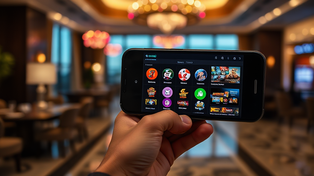
Most of a betting screen is understood before a single word is read. That is not an accident of design; it is the design. On tk999, a Bangladeshi-facing online betting platform, the interface leans heavily on visual cues to tell users where they are, what to do next, and how safe the experience is supposed to feel. This article looks at that visual language channel by channel: icons, colour, imagery, and motion. It asks what each one communicates, and where it can quietly mislead.
The point is not to praise or condemn the design. It is to help readers notice how much meaning arrives through shape and shade before any sentence is parsed. Once you see the channels separately, you can read a betting screen the way a designer does.
Icons: The First Language of the Interface
An icon is a promise of function compressed into a few pixels. On tk999, as on most mobile-first betting platforms, icons carry the navigation load: a home mark, a wallet or balance symbol, a list of sports, a grid of games, and a profile or account figure. Each one is a small contract: tap here and something predictable happens.
The strength of icon-led navigation is speed. A user who cannot read English comfortably can still recognise a football, a cricket bat, or a spinning reel symbol. That matters for a platform aimed at a Bangladeshi audience where language preference varies. The weakness is ambiguity. A generic bell could mean notifications, alerts, or promotions. A coin icon could mean deposit, bonus, or history. When icons are not paired with short labels, users guess, and guessing produces mis-taps.
Where icons earn their keep
Icons work best when the action is universal and the consequence is small. A back arrow, a search magnifier, or a close cross is nearly unambiguous. They also work well as repeated anchors across screens: the same wallet symbol in the header and in the account menu teaches the user to trust it.
Where icons start to blur
Problems appear when icons describe money. Deposit, withdraw, bonus, and balance are four different concepts that often share similar coin-and-card imagery. If a new user confuses a promotional token with a cash balance, the visual design has failed at the exact point where clarity matters most. The fix is rarely a prettier icon; it is a text label placed close enough to be read in the same glance.
Colour: The Fastest Signal on the Screen
Colour is processed before shape and long before text. On a betting interface, colour does three jobs at once. It establishes brand identity, it sorts elements into primary and secondary actions, and it signals state: selected, available, locked, or live. A single strong accent colour on a neutral background tells the eye where to go first, which is why most platforms reserve their brightest hue for the main call to action.
On tk999, the practical question is whether colour is used consistently enough to be learned. If green always means available and red always means closed or risky, users absorb that grammar in minutes. If the palette shifts between screens, or if promotional banners introduce new bright colours on every visit, the grammar dissolves and colour becomes decoration rather than instruction.
The contrast test
Readability depends on contrast, not on how modern a palette looks. Light grey text on white, or white text on a bright accent, can look elegant on a design mockup and fail on a phone held outdoors in daylight. For a mobile-heavy audience, contrast is an accessibility feature, not a stylistic preference. Small odds figures and balance numbers are exactly the elements most likely to be set in low-contrast type.
Colour and emotional temperature
Warm colours tend to read as urgency or excitement; cool colours read as calm or trust. A platform that wants to feel secure may lean on deep blues and restrained accents, while one that wants to feel energetic may use saturated reds and oranges. Neither is wrong, but the choice shapes expectation. When promotional colour floods the screen, the calm signal is overwritten, and the interface starts to feel like a sale rather than a service.
Imagery and Motion: Atmosphere Versus Information
Photography and illustration set the emotional register of a betting platform. Sports imagery suggests action and knowledge; abstract gradients suggest technology and speed; illustrated characters suggest playfulness. On tk999, imagery is best understood as atmosphere rather than evidence. A photo of a stadium does not tell you which markets are open; it tells you what kind of place you are in.
Motion adds a second layer. Subtle transitions confirm that a tap registered. A pulsing live indicator communicates that an event is in progress. But motion also competes for attention, and a screen with several animated elements has no clear focal point. The useful rule is simple: motion should confirm an action or mark a genuinely live state, not decorate a static page.
When imagery oversells
The risk with rich imagery is expectation inflation. Glossy visuals can imply a level of polish, speed, or support that the underlying service may not match. A user who registers on the strength of a visual impression, including through the tk999 downloadable app, will judge the product against that impression. If the app is slower or plainer than the marketing imagery, the gap itself becomes the message.
Reading motion as a status cue
Well-used motion is informative: a progress bar shows loading, a highlight shows a selection, a countdown shows time remaining. Poorly used motion is persuasive: it creates urgency without new information. Readers can separate the two by asking a single question: did that animation tell me something I did not already know? If the answer is no, it was atmosphere.
A Short Note on Reading Visually
Put together, the visual channels on a betting platform form a kind of shorthand. Icons tell you where to go, colour tells you what matters, imagery tells you how to feel, and motion tells you something is happening. None of these channels is neutral, and none is fully reliable on its own. The skill worth developing is cross-checking: if an icon suggests one action and the nearby label suggests another, trust the label. If colour signals urgency but no deadline is stated, treat the urgency as styling.
For anyone exploring tk999, the practical takeaway is to slow down at the moments where visuals do the heaviest lifting: registration, deposit, and bonus screens. Those are the places where a coin icon, a bright button, or a celebratory animation is most likely to stand in for a clear explanation. Reading the words behind the visuals is not a rejection of good design; it is the completion of it. A screen that speaks without words is efficient, but the user who also reads the words is the one who understands what the screen actually said.
Related articles
- Splitting the Cart: Per-Person Math for Friend Groups
- 5 Common Mistakes When Hiring a Desentupidora Vila Maria
- You Already Signed Up for wwwtk999. Now What?
- 카지노솔루션 안의 문구, 누가 어떻게 정하는가
- From First Call to Flowing Drain: A Parque São Lucas Walkthrough for First-Timers
- چرا بیشتر کاربران اف بت را اشتباه میشناسند و چطور این مشکل حل میشود